How to Track Test Pass Rate Over Time
Why a single run cannot tell you if your test suite is getting healthier or worse, and how to track pass rate as a trend across runs so you can see the direction
Aug 7, 2026 · Updated: Aug 9, 2026

To track test pass rate over time you need to store the result of every run and then look at the pass rate as a trend rather than a single number, because the useful question is not what your pass rate is today but which direction it is moving. A pass rate of 92 percent means something completely different if it was 98 percent last week versus 85 percent last week. One is a suite quietly degrading, the other is a suite recovering, and today's number alone cannot tell them apart. This post covers why pass rate only becomes meaningful across runs, what the trend actually tells you, and how to see it without building the tracking yourself.
Why is a single run's pass rate not enough?
Pass rate on its own is a snapshot, and a snapshot hides the thing you actually care about, which is direction. Ninety percent passing sounds fine until you learn it was ninety five last week and ninety eight the week before, at which point it is not a status, it is a slide. Equally, a run that is failing more than usual might be the low point of a recovery that is already turning around. You cannot tell which story you are in from a single number, because the information that distinguishes improvement from decline lives in the comparison between runs, not in any one run.
This is why teams that only ever look at the latest run tend to react rather than steer. They see red, they fix it, they move on, and they never notice that the suite has been slowly getting less reliable for a month. Tracking pass rate over time changes the question from what failed today to whether the suite is getting healthier or worse, which is the question that actually lets you manage quality rather than firefight it.
What does the trend tell you that the number does not?
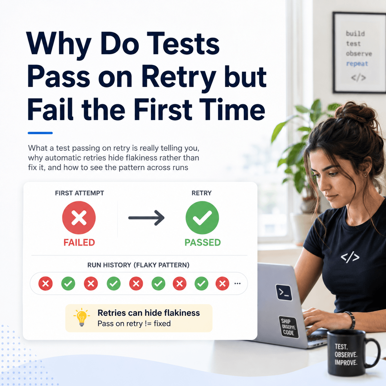
A pass rate trend across runs surfaces patterns that a single figure cannot. A steady decline over successive runs points to accumulating fragility, tests or code quietly rotting as changes pile up. A sudden drop on a specific run points at a change introduced there, a regression you can trace to a point in time. A saw tooth pattern, up and down run after run, points at flakiness rather than real failures, because genuine pass rate does not oscillate at random. And a slow climb tells you that stabilisation work is paying off, which is worth knowing so you keep doing it.
None of these are visible in today's percentage. They only appear when the runs are lined up in sequence, which is the whole reason to track pass rate as a trend rather than a reading. The shape of the line is the information.
What do you need to track pass rate over time?
Two things, and the first is the one people skip. You need the result of every run stored, not discarded when the next run starts, because you cannot build a trend from data you threw away. Most CI systems show you the current run and overwrite it with the next, so by default the history you would need to compute a trend does not exist. The prerequisite for tracking pass rate over time is retaining results across runs in the first place.
The second thing is a way to view the stored runs as a trend rather than a list. Once results accumulate, you want the pass rate plotted or summarised across recent runs so the direction is visible at a glance, rather than opening twenty individual runs and comparing them by hand. Storage gives you the raw material; the trend view turns it into an answer, and it is one of the things worth looking for when comparing test automation reporting tools
How do you see the trend without building it yourself?
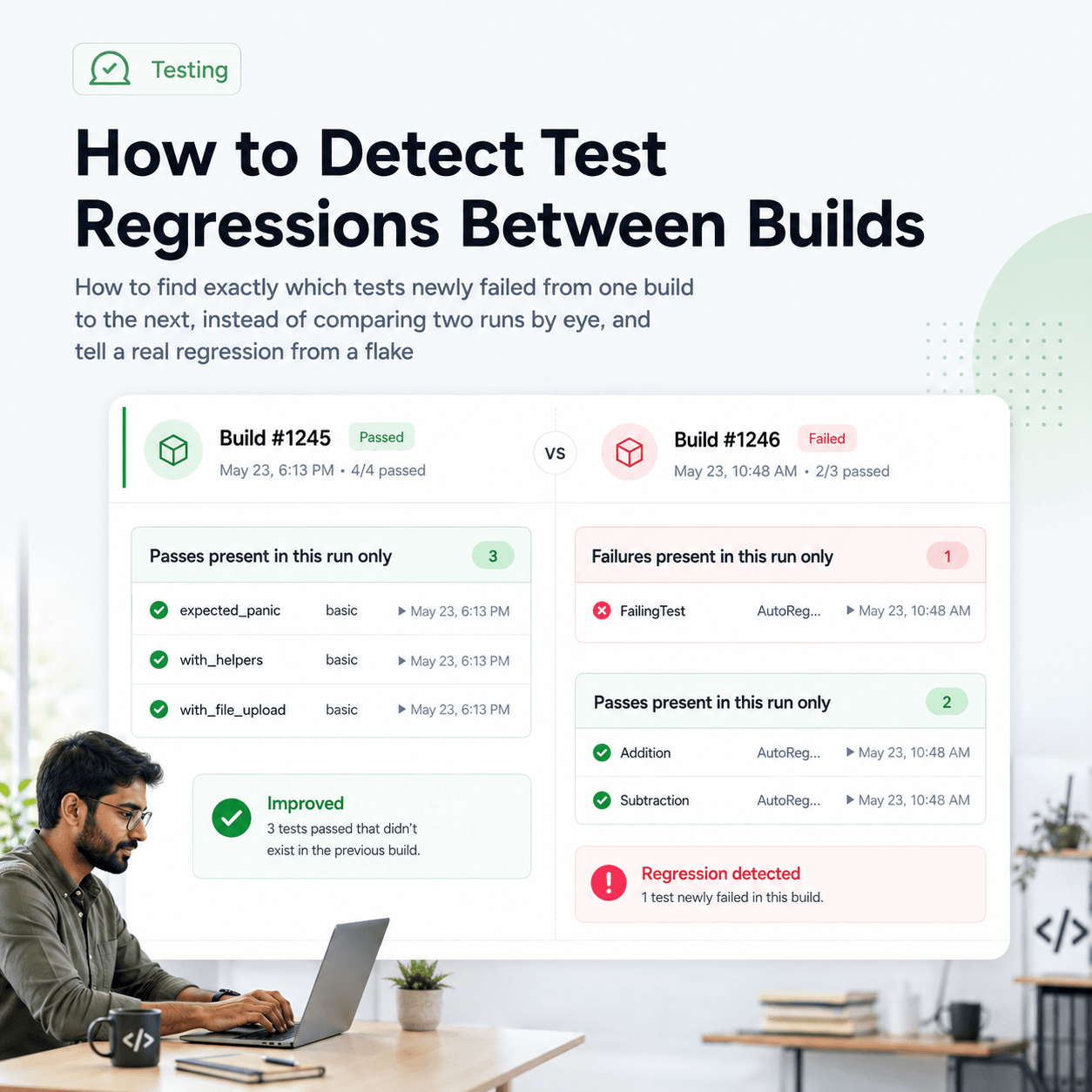
Tesults retains every run pushed to it, so the history that pass rate tracking depends on exists automatically rather than being overwritten. On the dashboard, each target shows at a glance whether its pass rate has improved or deteriorated, so a project with many test jobs gives you a quick read on which are trending the wrong way without opening each one. For a closer look, the supplemental analysis view plots the pass rate as a trend across recent runs, each run a point on the line so the direction is visible immediately, and summarises results aggregated across runs over a recent window, for example total pass, fail, and other counts across the last several days rather than just the latest run. Alongside the trend it shows which tests just started failing, just started passing, and are continuing to fail, so you see not only that the pass rate moved but which cases moved it.
That last point is what makes a trend actionable rather than merely informative. A falling pass rate is a prompt; the tests that started failing are the cause. Seeing both together turns a downward line into a specific, workable list. From there you can drill into an individual case, where its result is shown aggregated across recent runs with a stability classification, the number of runs analysed, and any patterns detected in its history, so you can tell whether a particular test is genuinely stable, newly broken, or simply unreliable. And because flakiness shows up in the trend as oscillation, the same views help you separate a genuine decline from a suite that is simply flaky, which is covered in more depth in how to detect and handle flaky tests. Keeping the underlying history is the prerequisite for all of it, discussed in how to keep a history of test results instead of losing them after each CI run.
Pass rate is only useful as a direction, not a number, and direction only exists across runs, so tracking it over time comes down to retaining every run and viewing the pass rate as a trend rather than a snapshot. Do that and you can tell the difference between a suite that is quietly degrading and one that is recovering, which is the difference between steering quality and reacting to it. The trend and trajectory views described here are documented under supplemental analysis and the project dashboard.