New Look
Cleaner, simpler and more focused
Nov 22, 2017

Tesults has rolled out a cleaner and simpler new look designed to prioritize highlighting results data content with greater clarity. We make regular visual enhancements every week and even multiple times a week, however this is our third major overall visual change from the original interface Tesults launched with in October 2016. The big change has already been rolled out but there will be on-going enhancements and refinement indefinitely.
Better clarity is achieved by highlighting results over a cleaner canvas without distractions. This allows you to focus on what’s important, your project’s technical status.
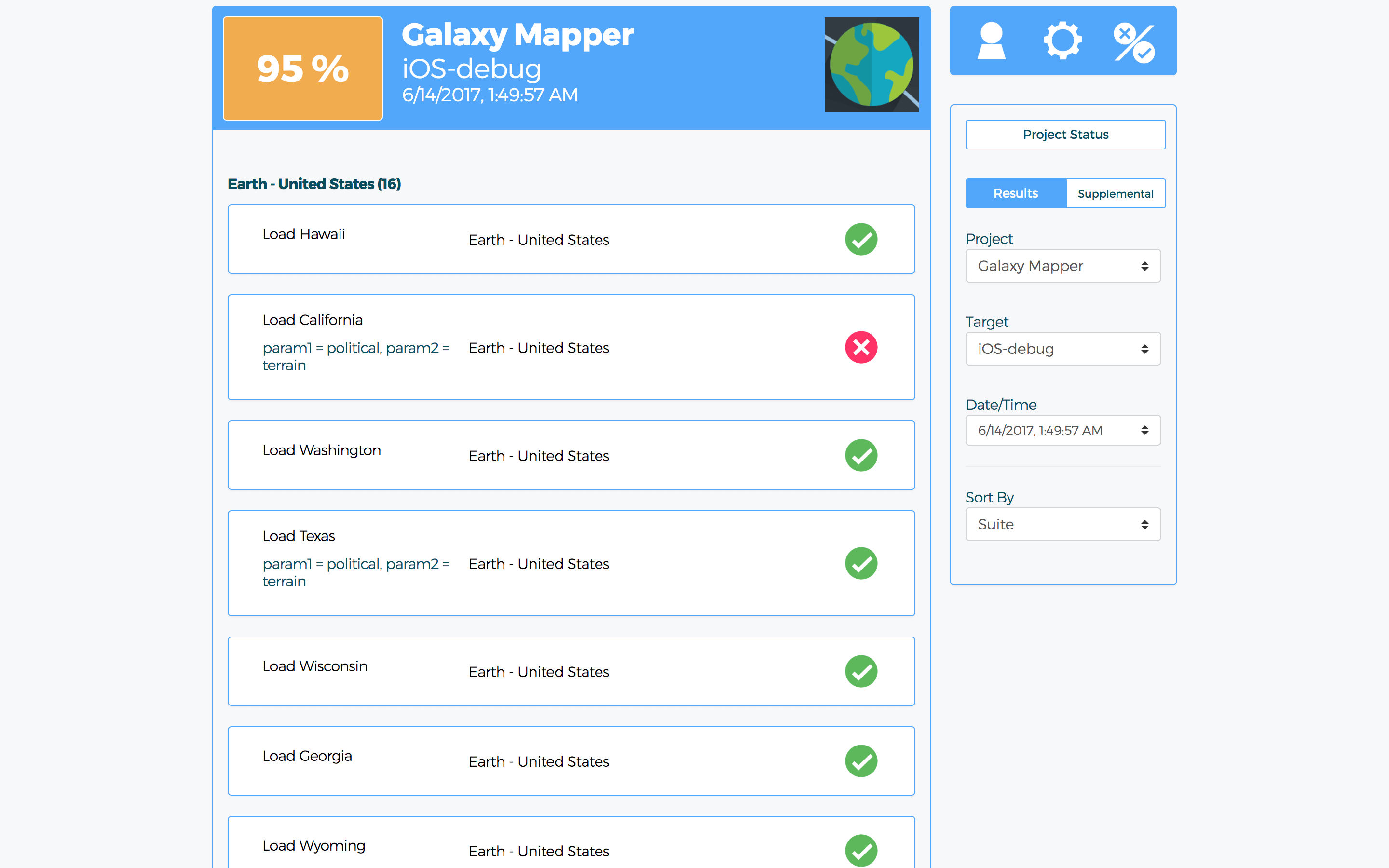
The results view, before:
The results view after:
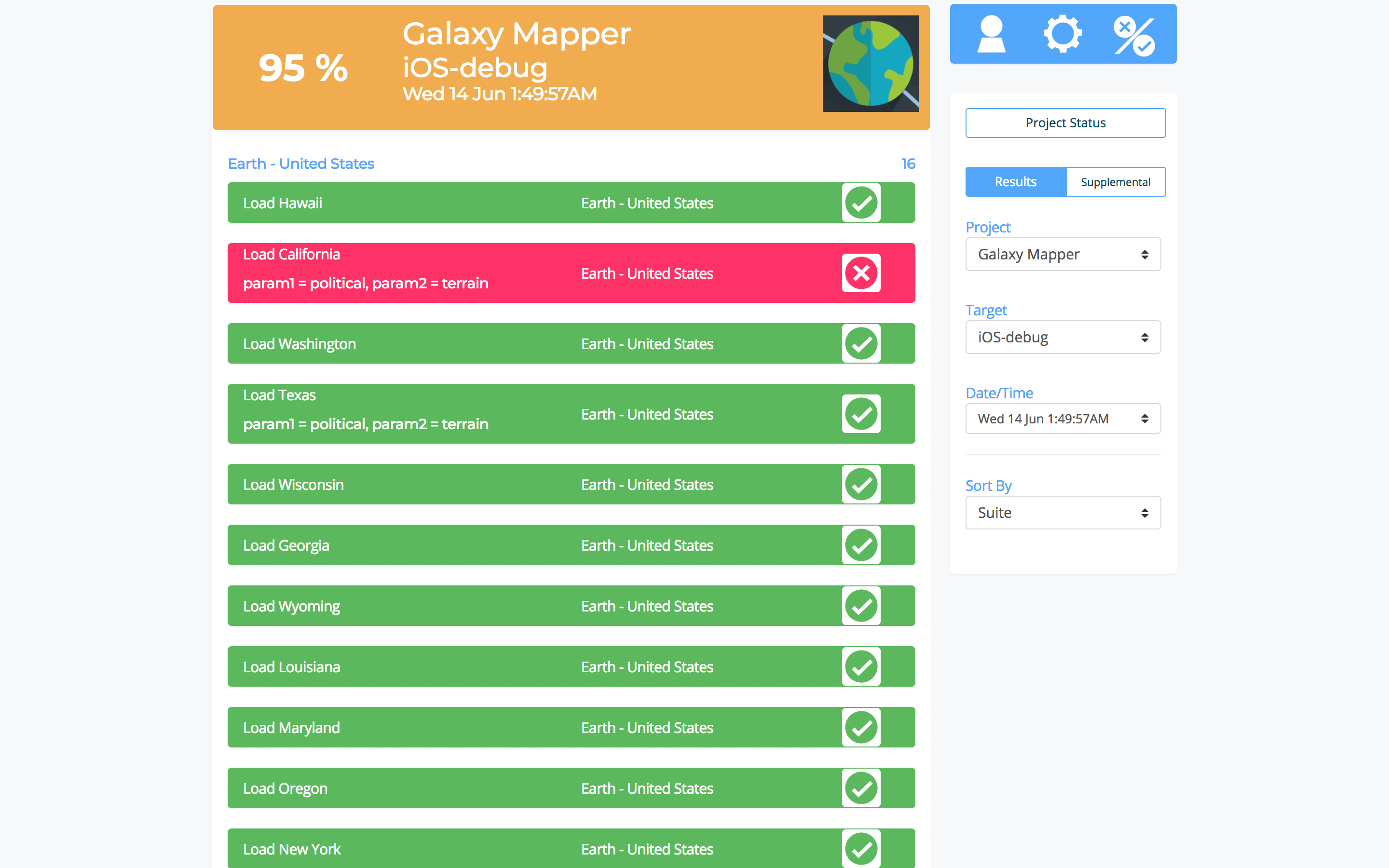
If you look at the old view it might take a you a second or two to spot where the issue is, in the new design it’s instant.
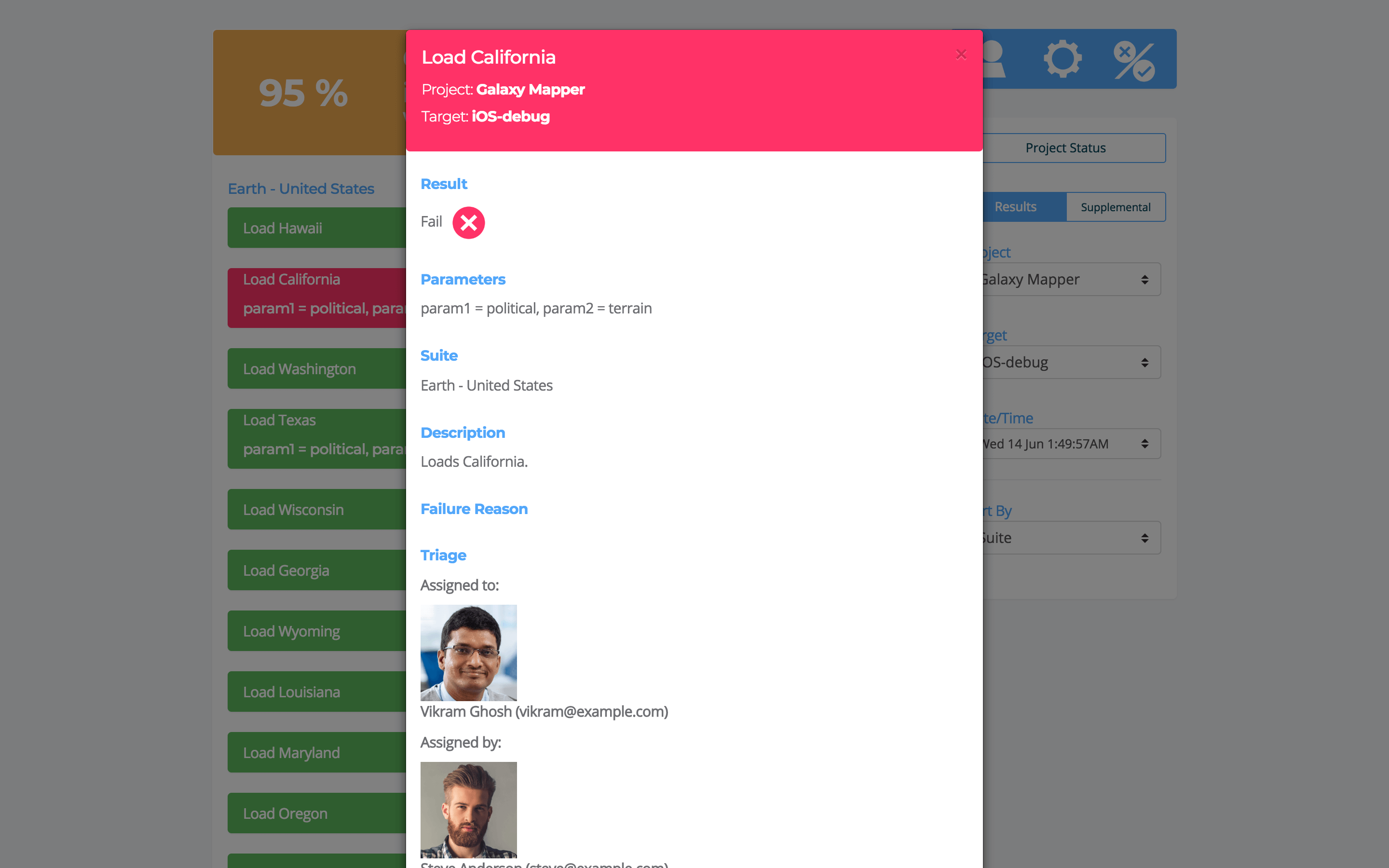
In the test case view the color of the header and foot makes clear what the result of the test is without even looking at the result outcome:
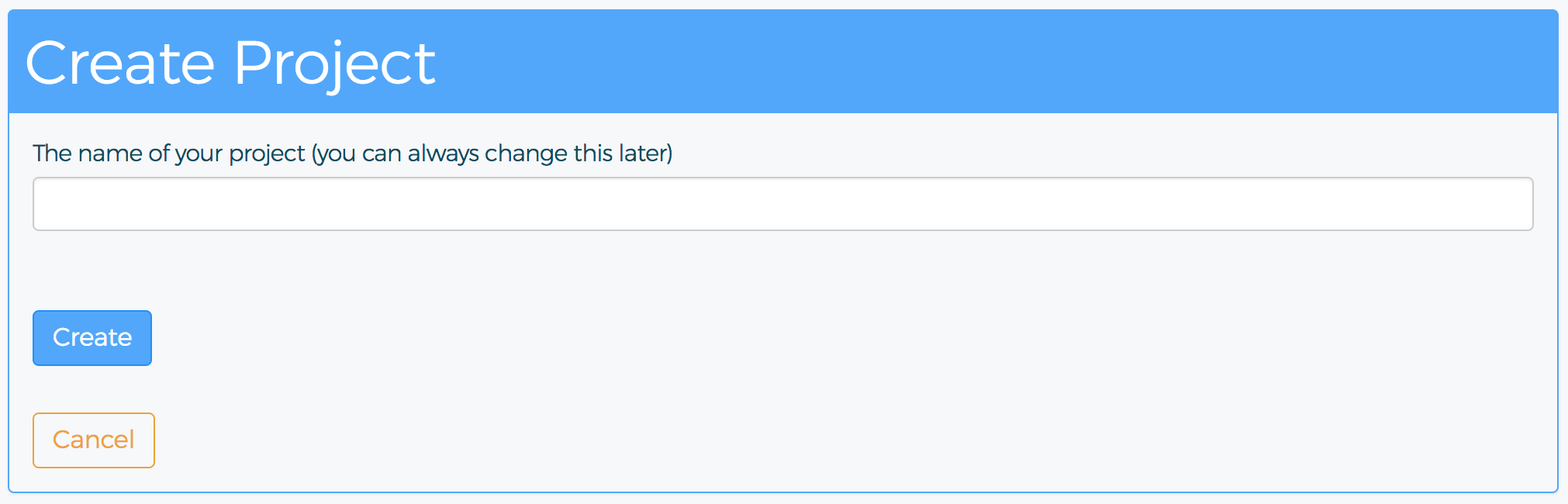
Create project, before:
Create project, after:
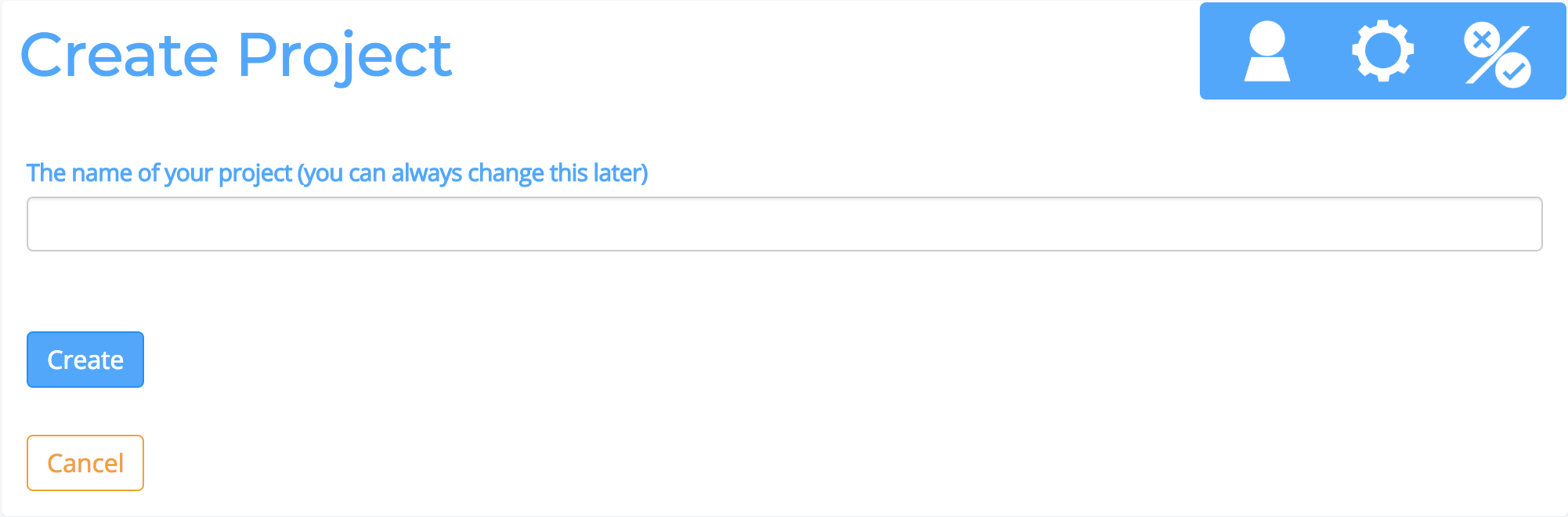
Gone are all the lines and boxing, the platform should disappear into the background, the whole focus should be on your build status, your automated test results and your logs, files, and understanding who’s working on fixing what.
As always Tesults is responsive and the same new look is automatically ready for your mobile browser too.
We hope your team enjoys the new visual design and that it makes your build and automated test results status clearer than ever before. Your feedback is welcomed, contact support@tesults.com with subject ‘New Look Feedback’.